13 May 2021
Reading time: 11 min
Creating a project from scratch is an exciting experience for both the customer and the entire development team. And in this case, the task of the designer is to apply all his skills in order to convey the client's vision of the project for developers and users as accurately as possible. Moreover, we are talking not only about professional / artistic skills, but also about the ability to competently organize communication, find a common language with the customer, understand his wishes ... Telepathy and mind reading would be very useful, since the client cannot always explain in words what he wants.
Formulation of the problem
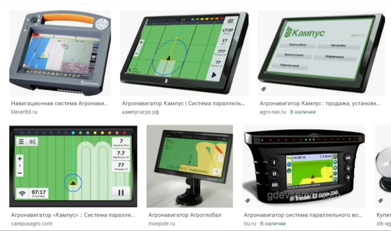
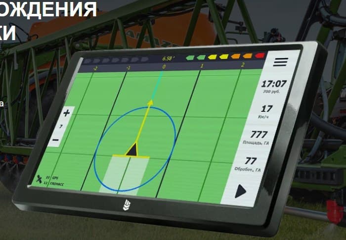
In this case, the designer was faced with the task of realizing the customer's idea as accurately as possible when creating an agronavigator application (fortunately, not adaptive and designed for one single device - a tablet). The specifics of the task are fully reflected in the word “agronavigator”. Those who have not directly come across this device when working on agricultural machinery usually make assumptions that this is “a thing so as not to get lost in the field”. To see what the different agronavigators look like, take a look at the illustrations:
In fact, the agronavigator has much more tasks and they are much broader than simple orientation. The most important thing is to display the processed area of the field (for example, watered with fertilizers), taking into account gaps and overlaps (this is important in order to understand how effectively the processing is carried out), this is the fixation of many parameters, such as speed, distance traveled, work time, percentage of its completion , modes of operation, communication with satellites, deviation from the course, vehicle parameters ... And much, much, much more that was described by the customer in the TOR, as well as modified and supplemented in the process.
To display all this, a lot of functionality was assumed, which needed to be correctly placed in the interface, and of course so that the user could navigate in it right in the field while driving a moving tractor.
References
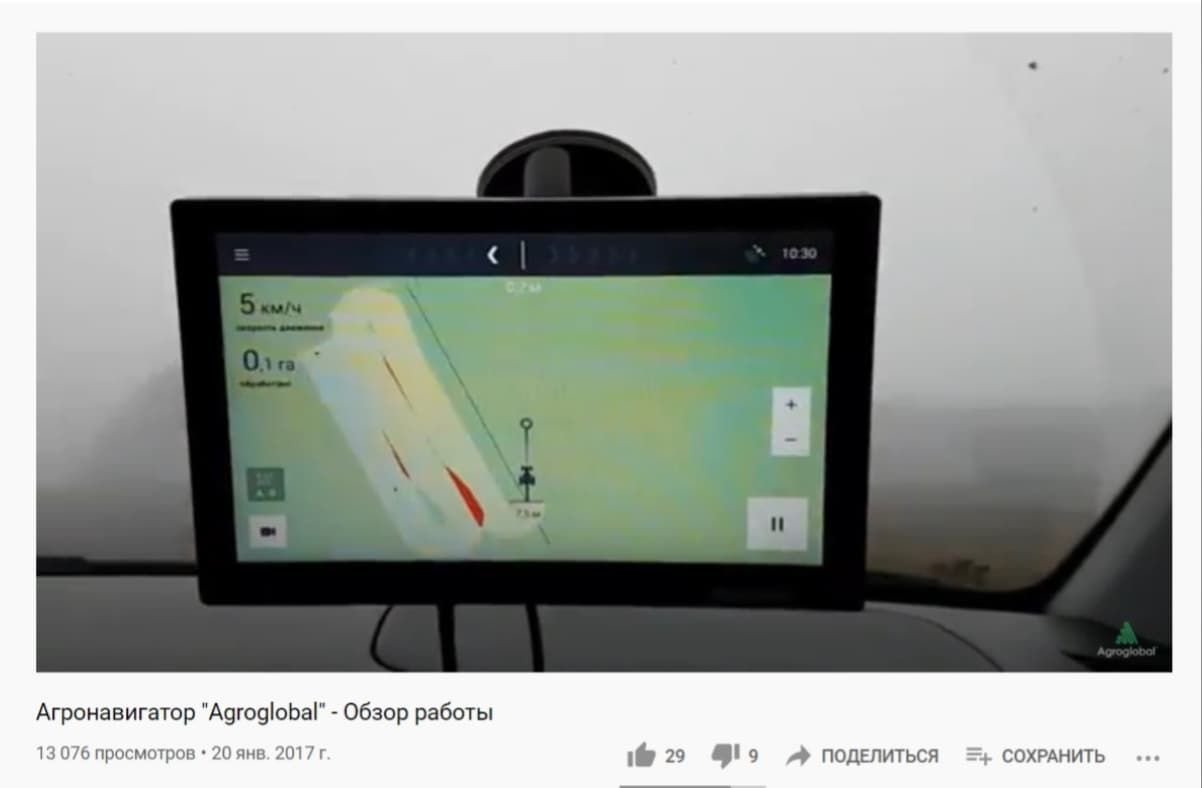
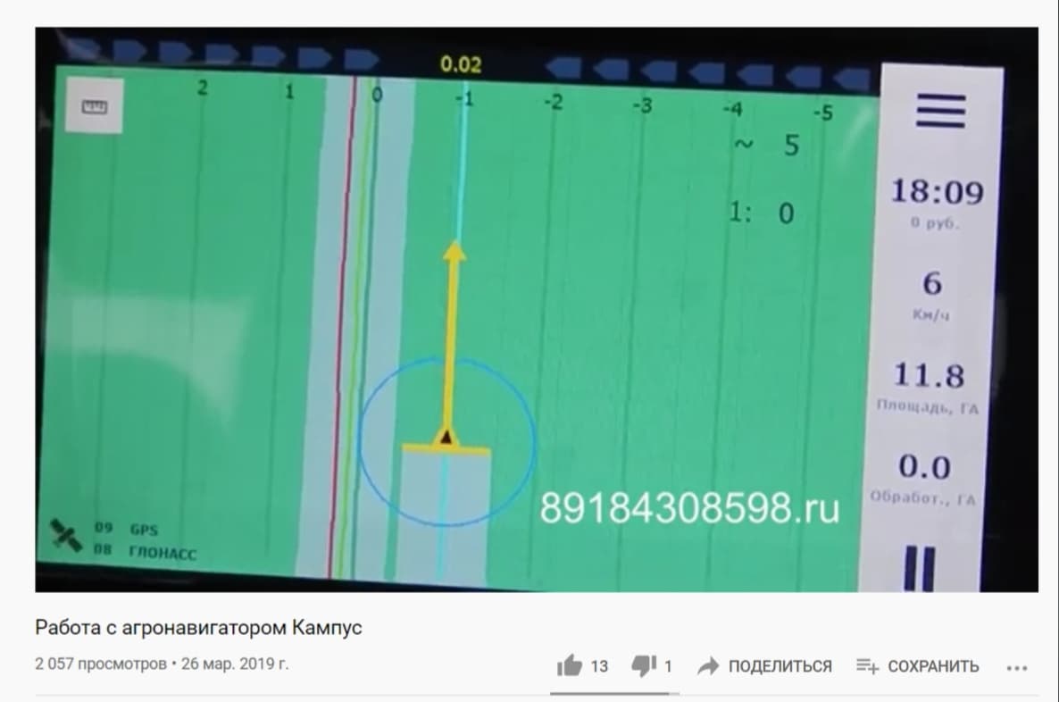
References are some examples, starting points, something that you can look at and say “do it like this, but in a different way”. Often, similar products are taken as references, the achievements and failures of competitors are investigated (you remember, it's better to learn from other people's mistakes). If you are interested, here, here and here you can see similar applications - with it we ourselves began to study the question of what an agronavigator is.
Here's what we saw, for example (Agronavigator "Campus")
But in this case ... It so happened that the customer had his own vision of both the functionality and design of the product - and it was fundamentally different from all “similar”. In addition, most of this functionality was generally unique, so the interface had to be developed relying only on the vision of an expert (in this case, it is the customer himself, the author of the project) and common sense.
Fortunately, the client provided a lot of UI references that have nothing to do with agronavigators, but reflect well the client's wishes regarding the design of the elements and the color scheme. This greatly facilitated our communication and subsequent work.
Beginning of work
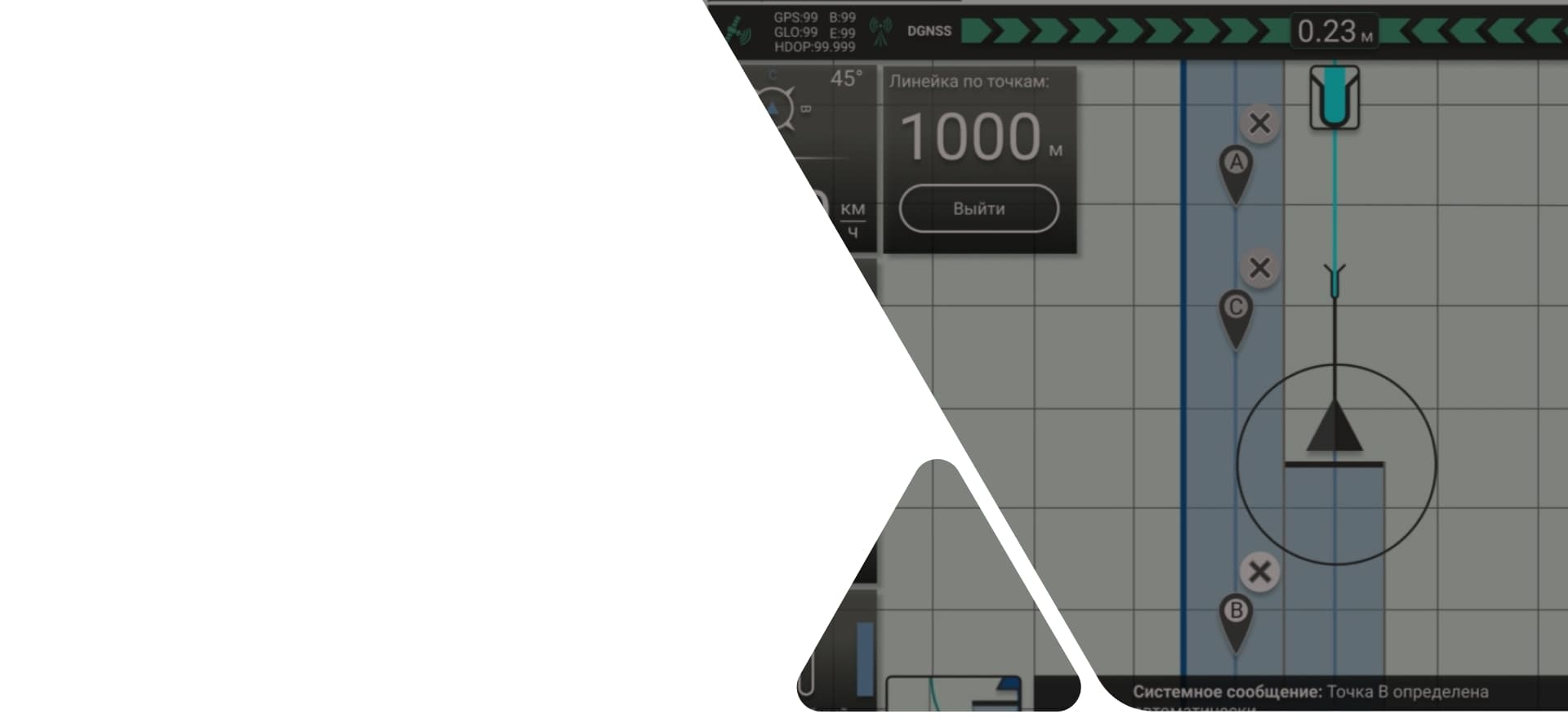
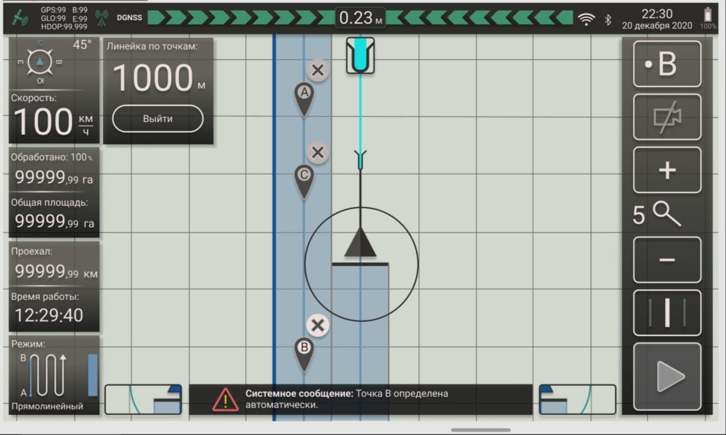
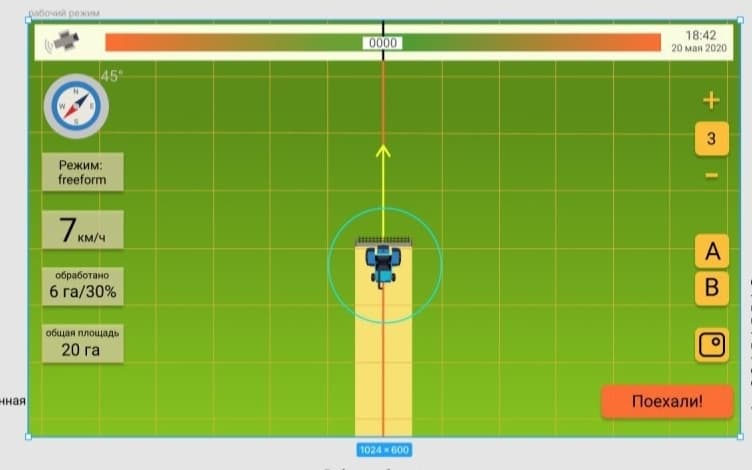
The main screen of the “agronavigator” type application is the so-called “working mode”. Basically, it is similar to a normal navigator: instead of a map, a field occupies most of the screen, an arrow indicating transport moves in the center (unless otherwise specified), a track and all kinds of navigation tips are displayed behind it and in front of it, and above, below and on the sides - buttons and information panels.
It was from the working mode that we started creating the application. You can read more about the step-by-step development of this screen in the second part of this case, but for now, let's pay attention to the solutions common to the entire application.
Discussion of references and a more detailed clarification of the customer's requirements regarding the functionality led to the decision to implement a dark theme in the interface, to try to make it as simple and modern as possible - minimalism, flat design, simple fonts, contrasting, but calm colors ... Everything so that when driving a tractor in the field, both day and night, this interface is read as easy and understandable for the user as possible.
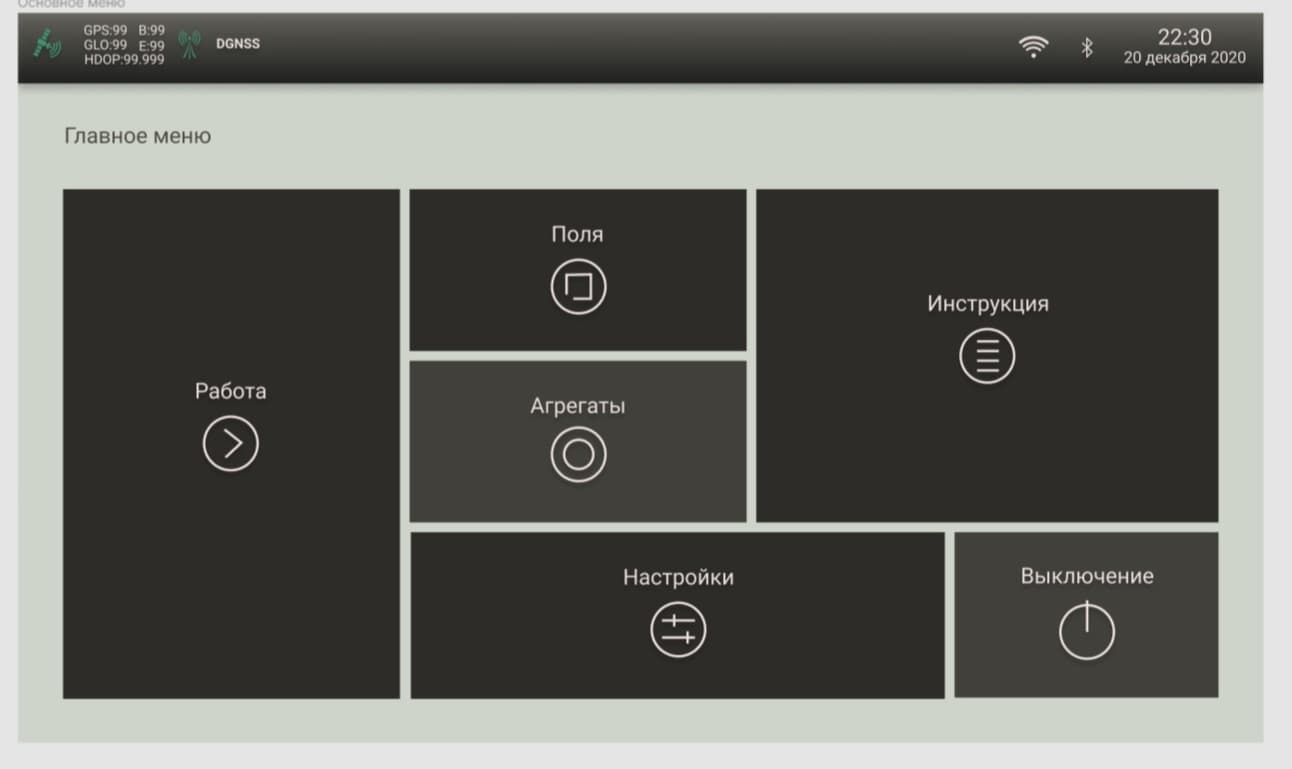
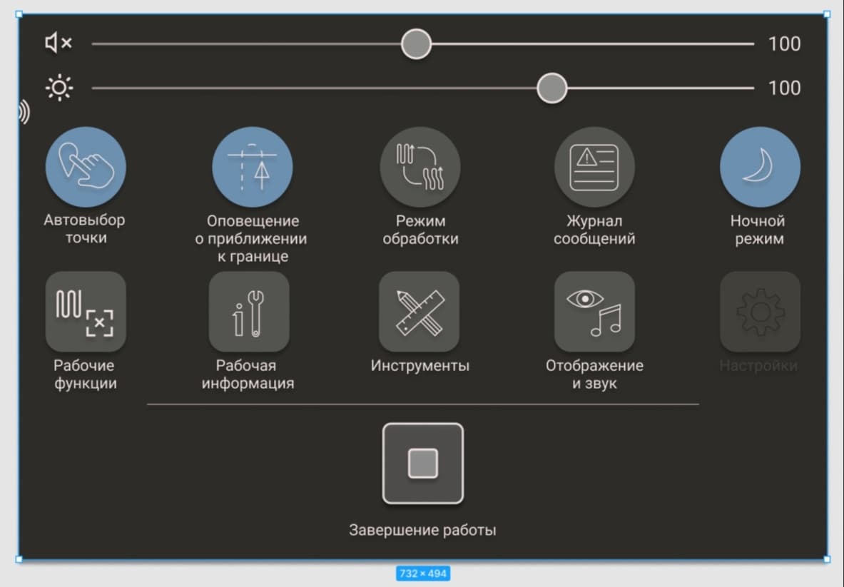
Main menu
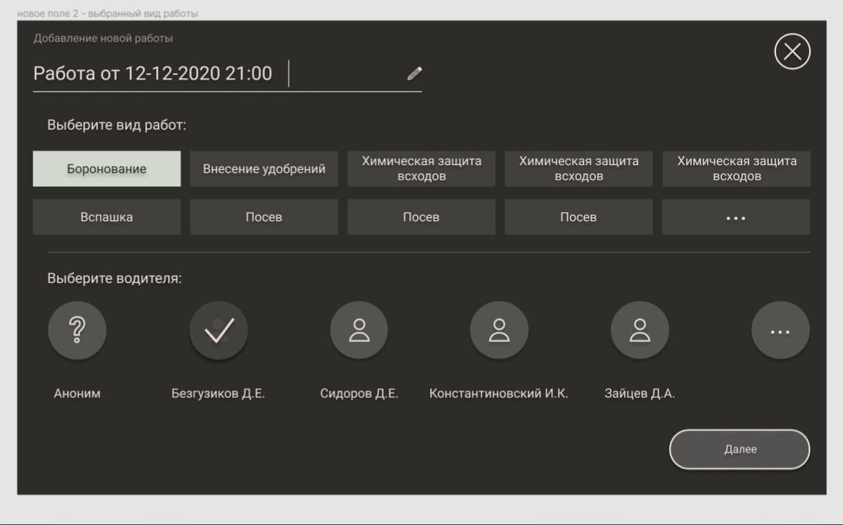
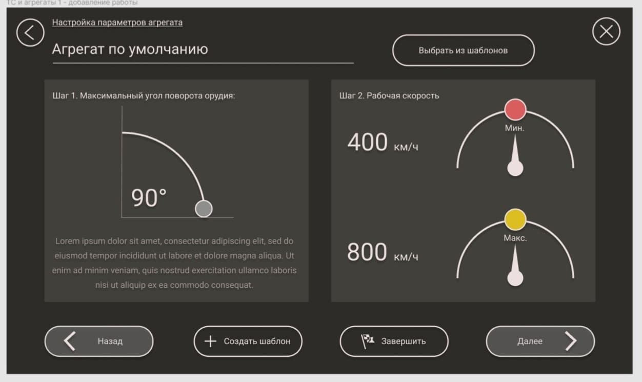
Adding a new job
Let's talk about “clarifying customer requirements”: this is a very subtle moment of psychological support for him. It happens that a client who embodies some new ideas is not immediately able to decide on the vision of a particular functionality - and often, having seen with his own eyes some idea of his own, he realizes that he was mistaken and wants to change everything. To deny him this means to divide the result of common labor by zero. What to do? This is where the designer comes to the rescue - after all, making changes to the design is much faster and much easier than to the code. This is what we actively used in our work on the agronavigator: we checked and rechecked, tried, changed, discussed and looked for a balance between functionality and simplicity.
To understand how serious the work has been done, just look at the illustrations - the first version of the operating mode and its final embodiment are fundamentally different. But this is only one screen out of many!
Working mode: starting and final version of the design
Spaceship elements
Yes, we called our case that way for a reason. It has already been said that the functionality of the operating mode added to the unit (a hypothetical tractor, combine and others like them) some similarity to Tesla, but if we talk about the entire application ... It's easier to see once: screenshots of the drop-down menu in operating mode, viewing "work" (this is a fixed stage of processing a particular field), selecting a mode, setting the unit, an infinitely long frame of all kinds of application settings...
Operating mode drop-down menu: enabled services are highlighted in blue
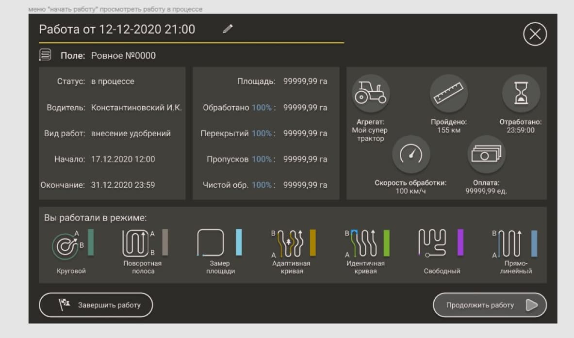
View work
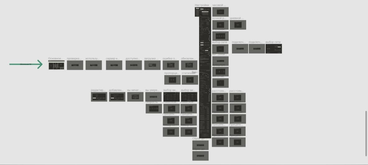
This is not a monster, this is the settings screen and all the modals to it
As you can imagine, the main characteristic of this design is capacity. There are a lot of buttons, a great variety of parameters, all this needs to be tamped into a very limited space, not forgetting that we have a tablet screen at our disposal, it is not large and cannot be “smaller” either. In addition, most of our future users are men who work in the field, on agricultural machinery: for their fingers, taking into account the shaking of the cabin, small buttons will be extremely inconvenient.
Our solutions
One of the most important decisions is, in fact, large "lightweight" buttons (due to the lack of fill in them, except for translucent elements). For switches - the simplest shapes and contrasting colors, no complex geometry: everything is laid out “in the cells” as in Tetris and structured.
Another is a clear division into zones: informational (in which the data collected by the device is displayed) and interactive (where this data is entered or can be operated on).
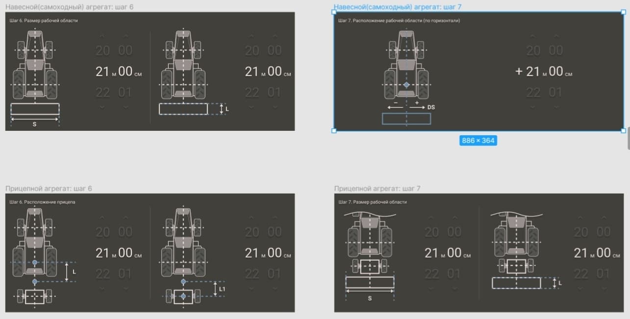
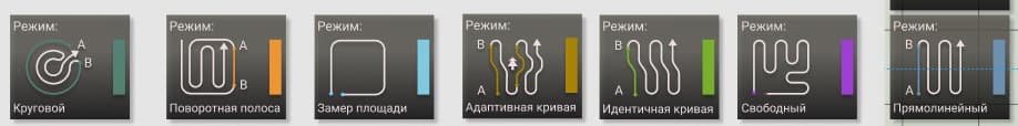
Throughout the application, we first of all strive to clearly show the user where and what he can operate with, and secondly, to make it look stylish and minimalistic. Here, clarity also comes to our aid: on the one hand, a full-fledged diagram of a tractor in the middle of a minimalistic application is like a submarine that has surfaced in the steppe. On the other hand, just imagine how many comments, explanations, buttons, scales, parameters and sliders we have avoided by simply sketching a tractor in the style of our agronavigator. From here, field diagrams, speed adjustments in the form of speedometers, and large color icons of operating modes appear.
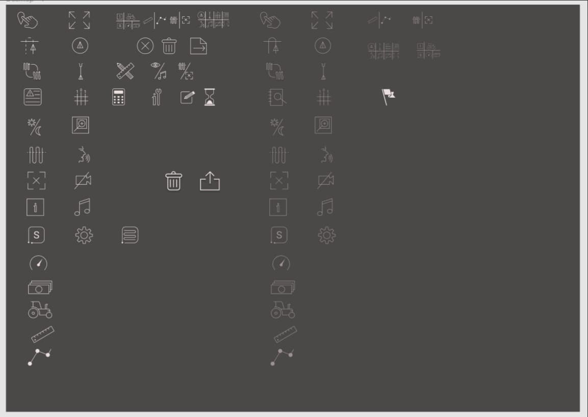
Also, in the name of many non-standard functions, we needed to develop an impressive set of icons, which also had to meet three requirements - to be stylish, minimalistic and well displayed in a micro-format. Agree, it is not a trivial task to put in a small symbol something called “On / off notification of approaching the border” or “On / off processing border detector”.
Logo
The culmination of the entire design process was the development of the logo. At this stage, we give the customer a choice: to express our vision (and then we will adhere to it as much as possible) or to completely give control over the logo to us. In this case, even in the very first TK, the client expressed his wishes, on which we relied: two spirals, one in the other and “possibly a gradient”.
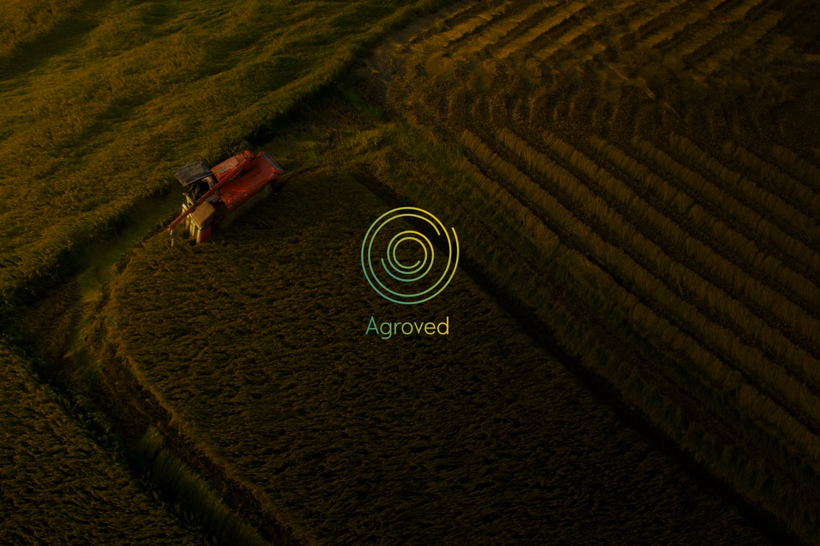
We will tell you more about the development of the logo in the third part, but for now we will just present the result: spirals of three turns, inscribed one into the other, a pleasant gradient from green to yellow (the colors were taken exactly the same as used in the application) and a calm, smooth font without serif.
Summary
At the moment, the design of the application is completed and transferred to the developers. By the way, the step-by-step elaboration of the screens and a clear definition of the style of our interface at the beginning of the work allowed us to start development as soon as the first frame was approved ("working mode"), which significantly saved time. Testing on the device revealed the minimum (two, or rather, one and a half) number of UI edits and almost 0 UX comments. And, of course, it always pleases when a customer appreciates your work not only in official "reviews", but also in the process of work in person.
read more